
Dark mode has recently been introduced across various apps and devices because it reduces eye strain and cuts glare. We’re excited to announce that Embrace now fully supports both light and dark mode, so you can choose the color scheme that helps you be more productive. In addition, we have made several UI upgrades, including simplifying the navigation panel, streamlining dashboard creation, adding better color contrast for key metrics, and improving our data visualizations.
Here’s what we’ll cover in this post:
- New dark mode feature
- New UI upgrades
New Dark Mode Feature Release
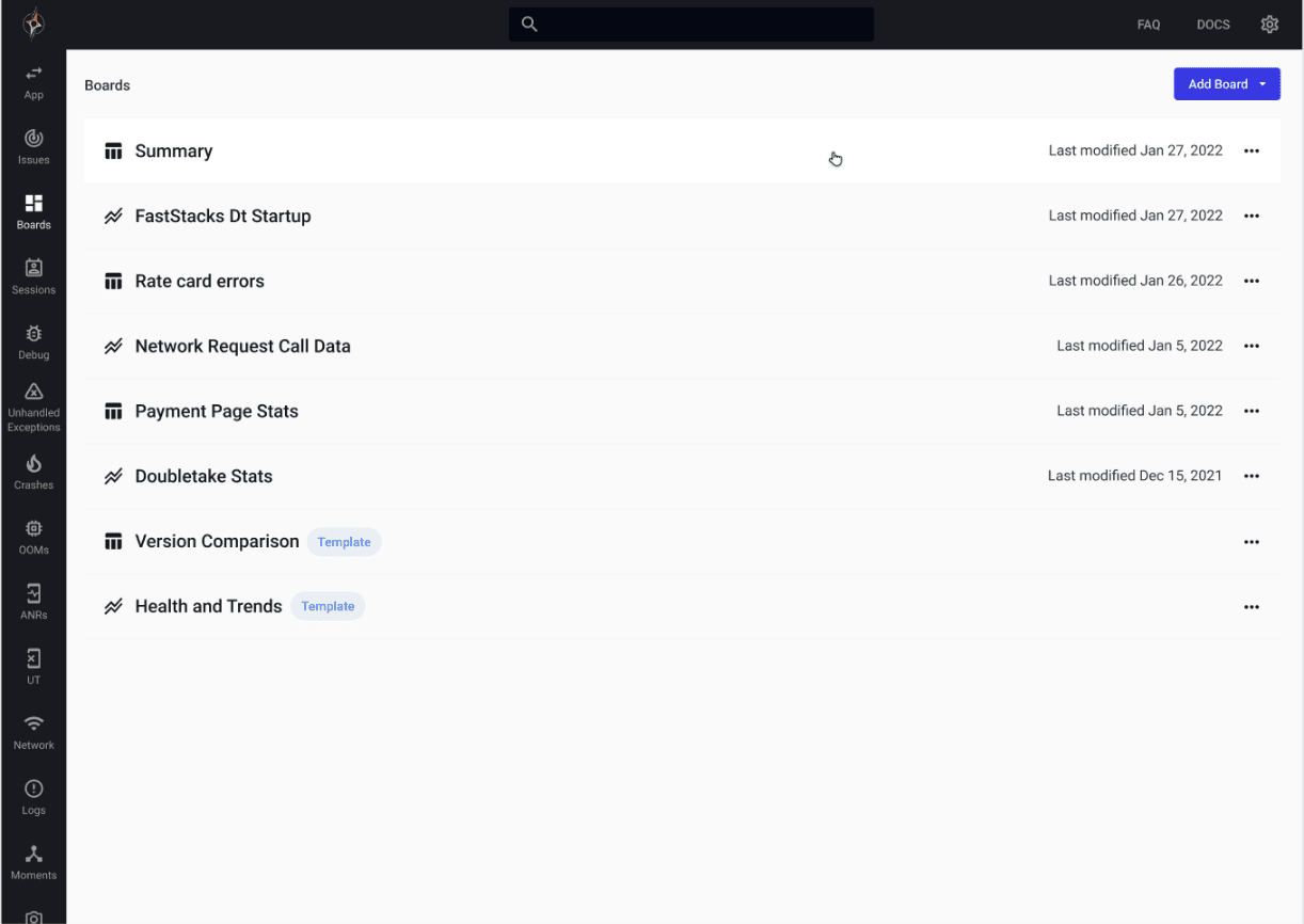
You can now choose between our light mode or dark mode from the settings panel. The following is what our new light mode looks like:
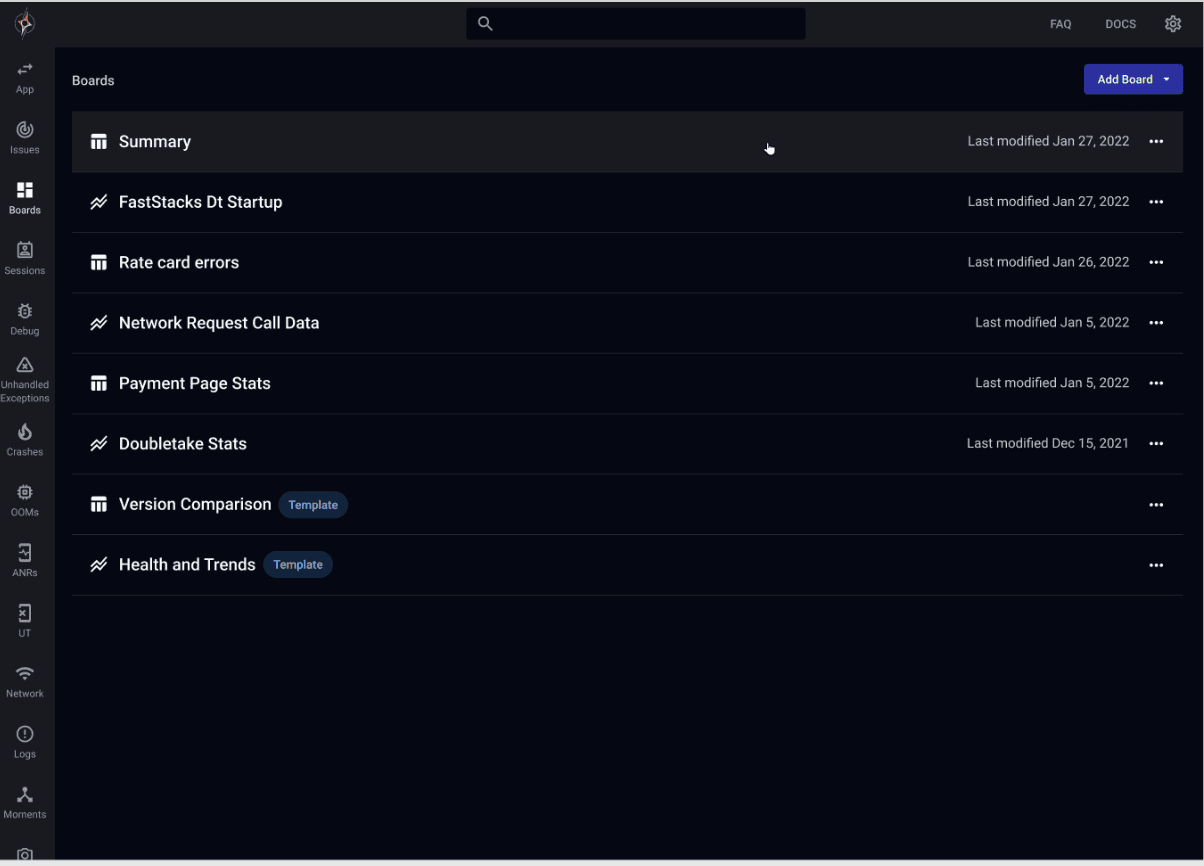
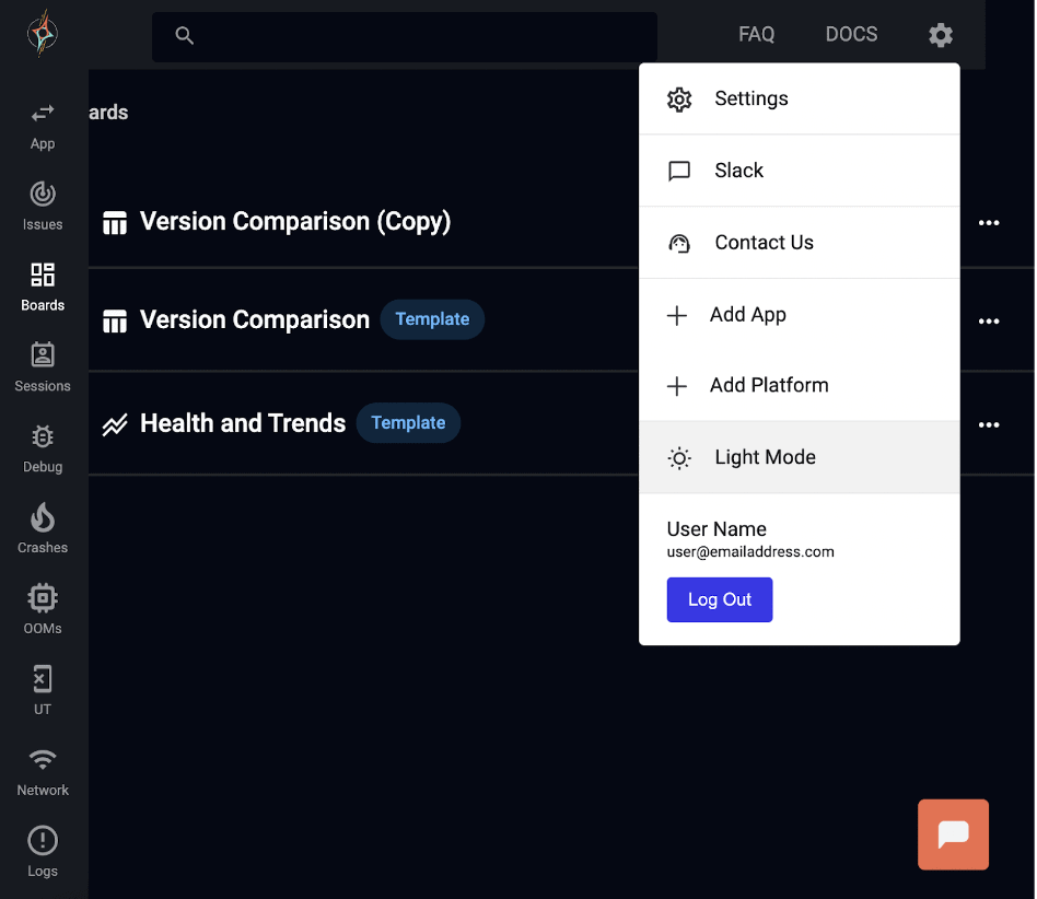
And here’s what our new dark mode looks like:
This feature is highly user-friendly and can be toggled on or off within the dashboard settings from light mode…
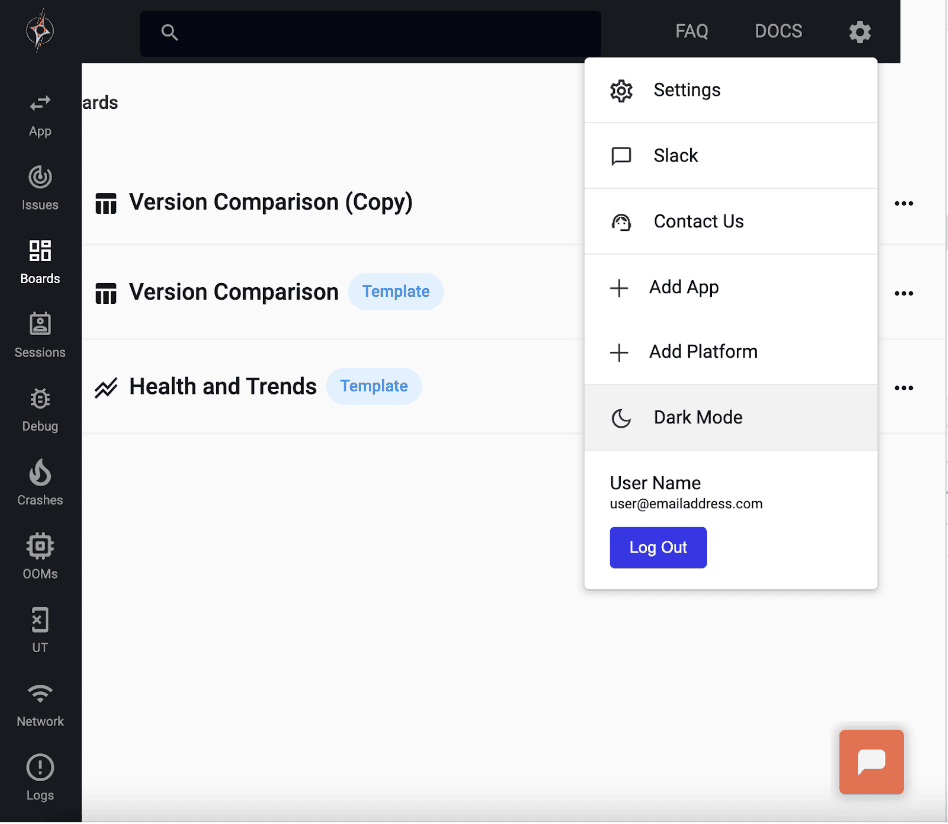
To dark mode!
We’ll now go into more details on the UI upgrades.
New UI Updates
We’ve made several improvements to the Embrace dashboard to make it easier to navigate, access data, create widgets, and more!
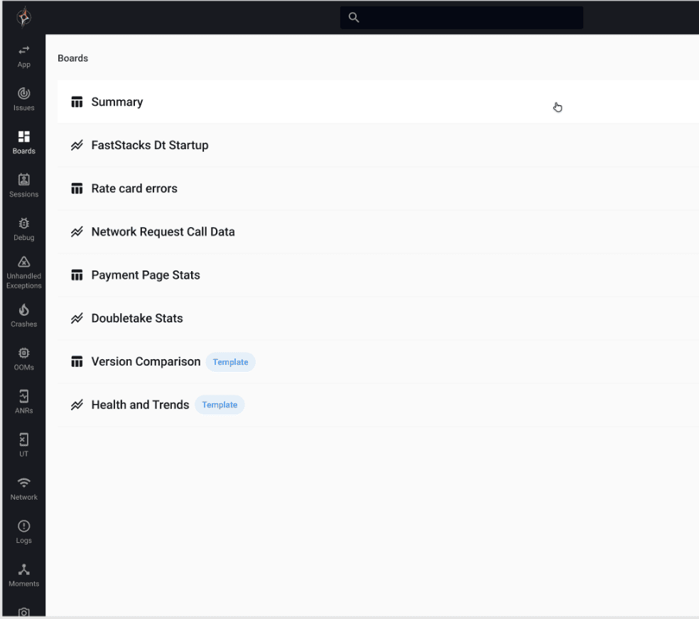
Simplified Navigation Panel
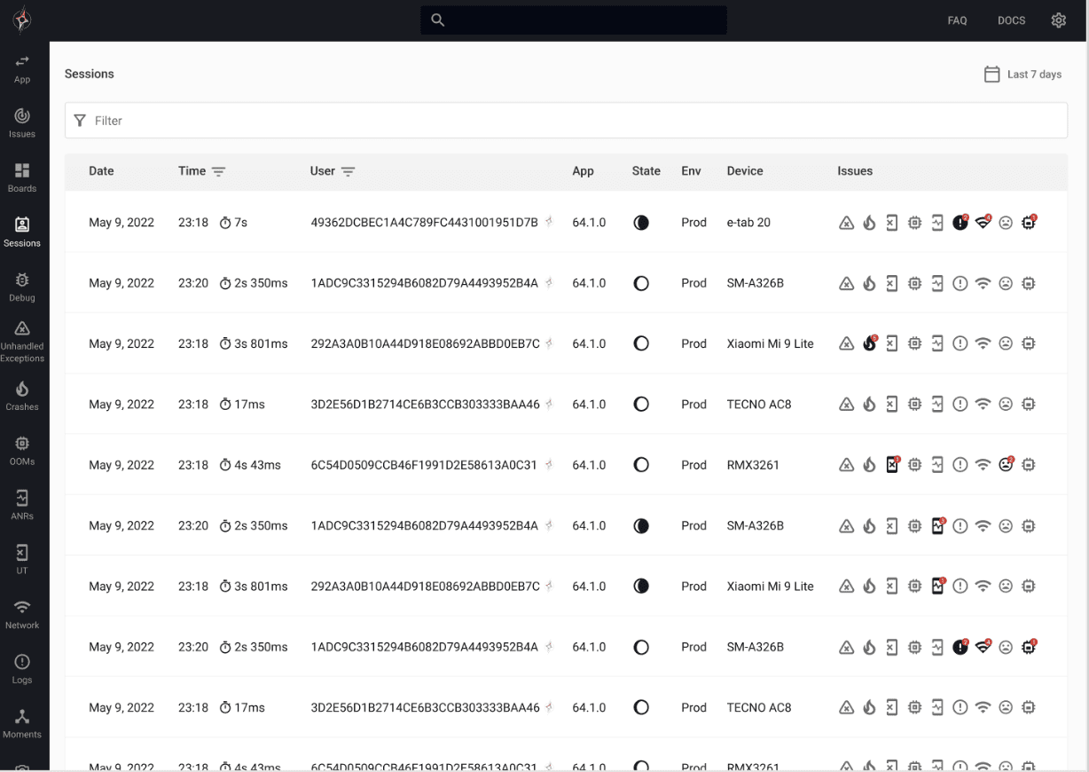
With the new UI benefits comes a wealth of helpful ways to speed up your data monitoring processes. Starting with our new simplified navigation panel, we’ve removed the expandable navigation panel in favor of a fixed-size one. Instead of toggling it open to read which icon represents which page, as users had to do in the past, you can now see it all with minimal horizontal space taking up the screen. This new panel lets users more intuitively switch between pages that capture different information from the dashboards page, user sessions, etc.
The below image shows what the updated navigation panel looks like on the left-hand side of the dashboard.
Streamlined Custom Dashboard Creation Experience
Moving forward, we now have a more streamlined custom dashboard creation experience, making it easier for users to visualize different app versions side-by-side in dashboard previews and follow the widget creation steps.
The following series of images showcases the step-by-step process of the streamlined widget dashboard creation on the new dashboard.
First, you choose what type of widget dashboard you want to show.
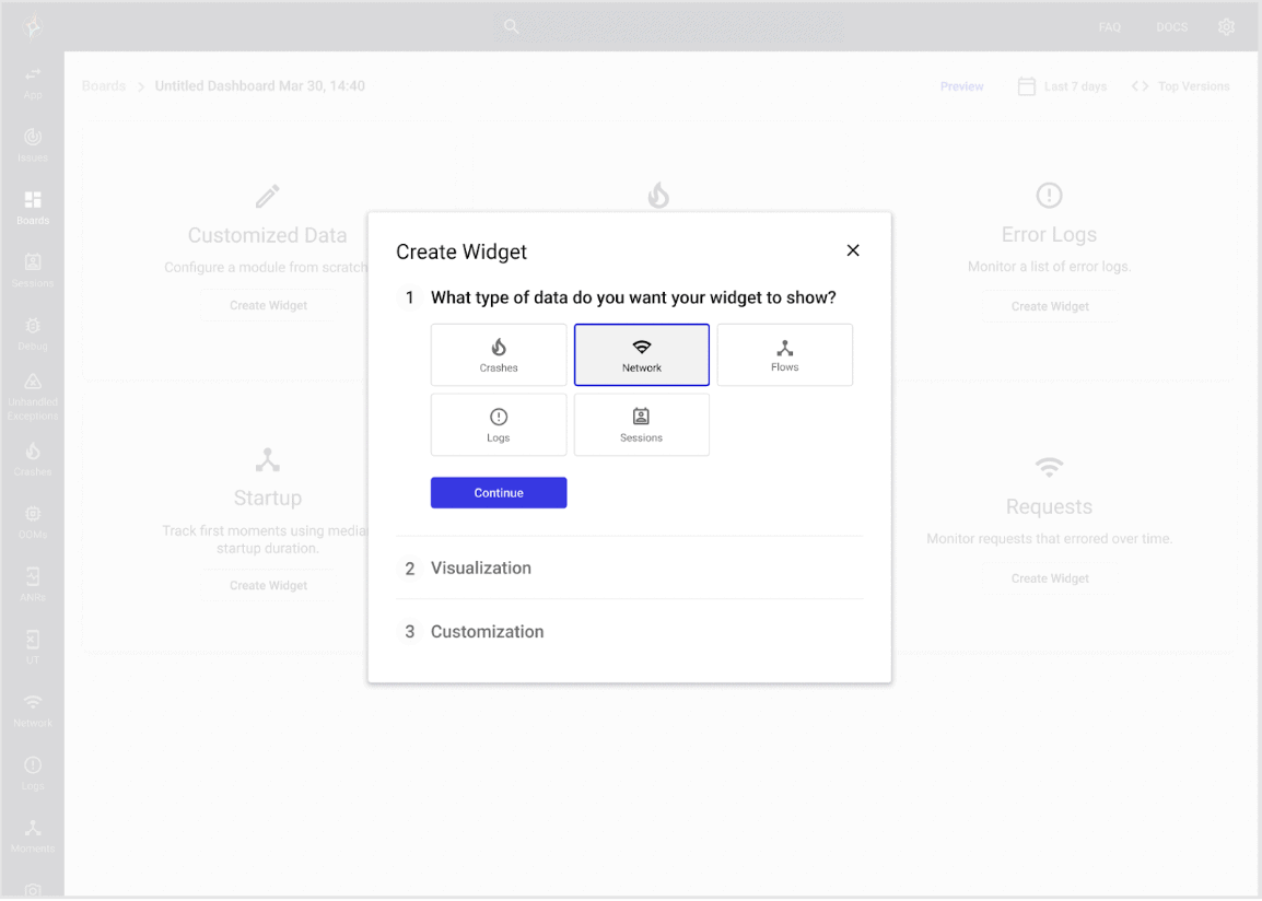
Next, you decide how you want to visualize this data, whether that be through a table or a graph.
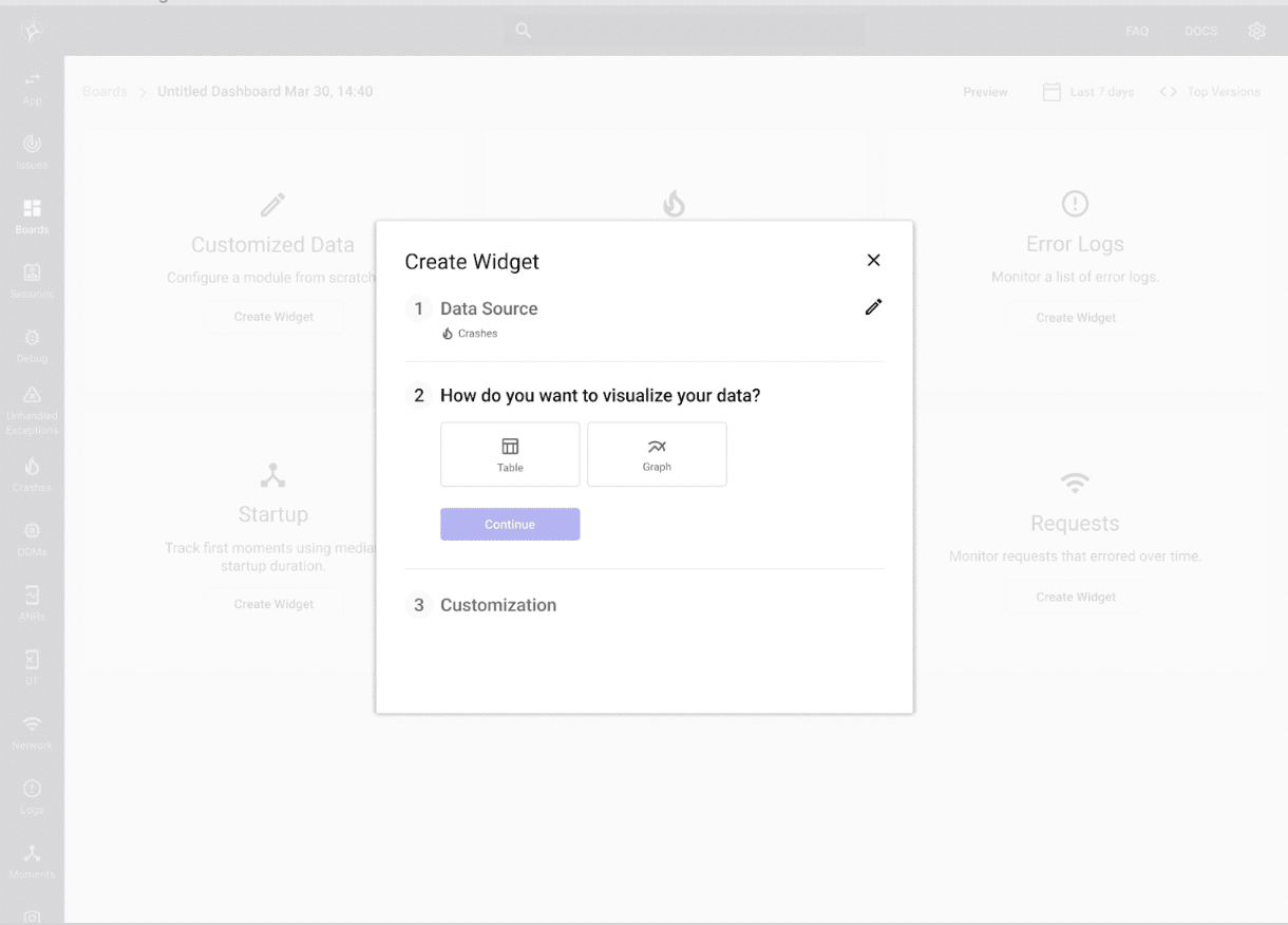
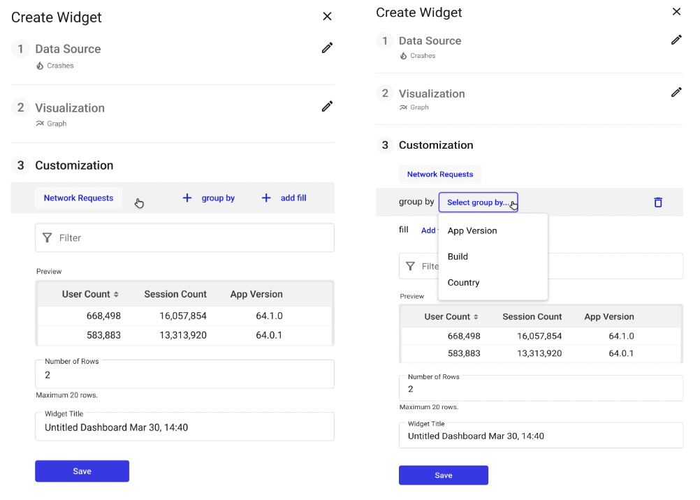
Next, you choose your metric customizations for your widget dashboard.
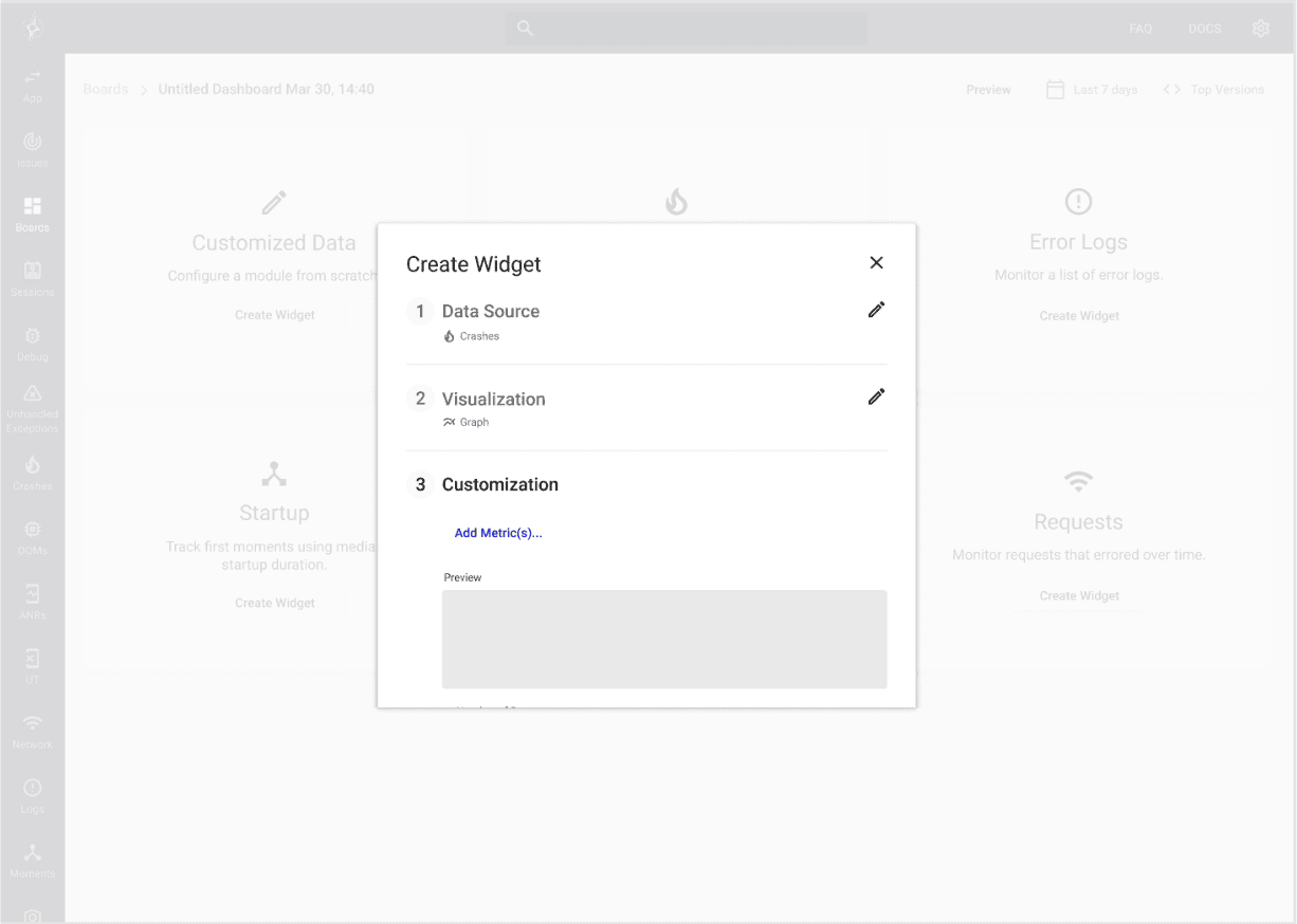
This image shows which customizations you can choose, what customized metric you want, and how you would like it to be grouped, whether that’s by app version, build, country, etc.
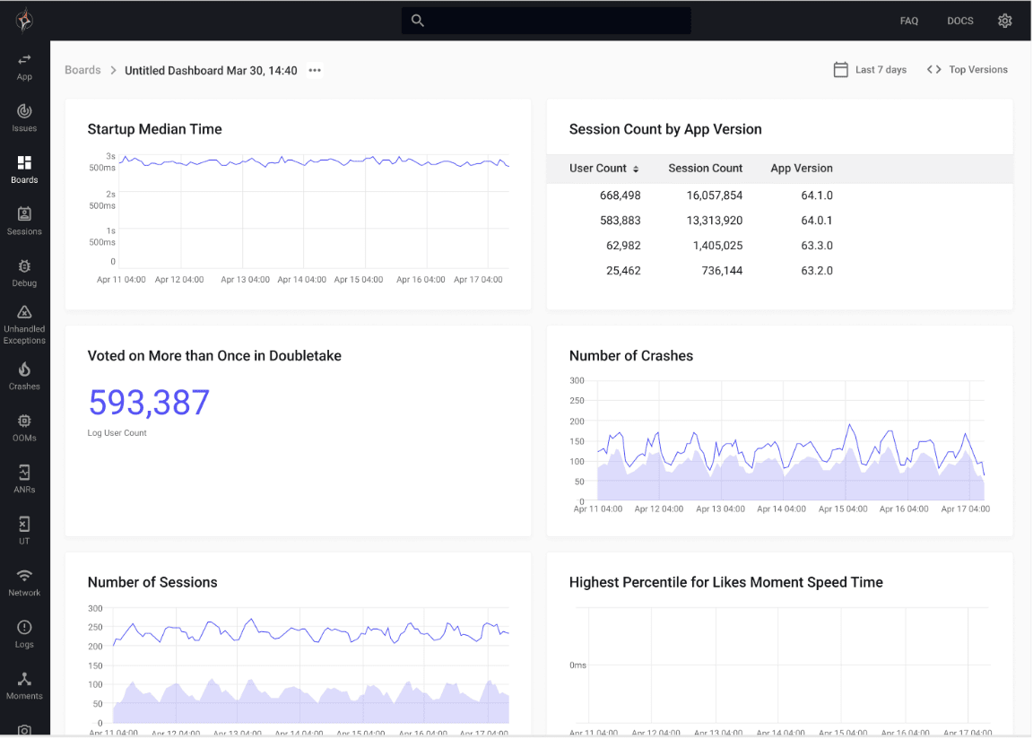
Finally, you have your completed and customized widget dashboard!
Better Contrast for Key Metrics
We have also updated the UI to have better contrast for key metrics on our user sessions page, ranging from:
- Crashes
- User terminations
- Network request status
- Custom properties
- Slow vs. average duration of moments
- ANRs
- Error logs
- Low memory warnings
This increase, in contrast, allows users to pinpoint crucial information and solve the issue more quickly.
The right side of this image illustrates the contrast update we have made. This makes it easier for users to see where an issue lies. Network errors or low memory warnings now pop out much more.
Cleaner Data Visualizations
Finally, we have improved data visualization across graphical representations, such as the network insights page.
We have changed the coloring of the graphs as well as increased the contrast. This gives users more easily digestible graphs to help them better understand their data, making the graphs easier to read.
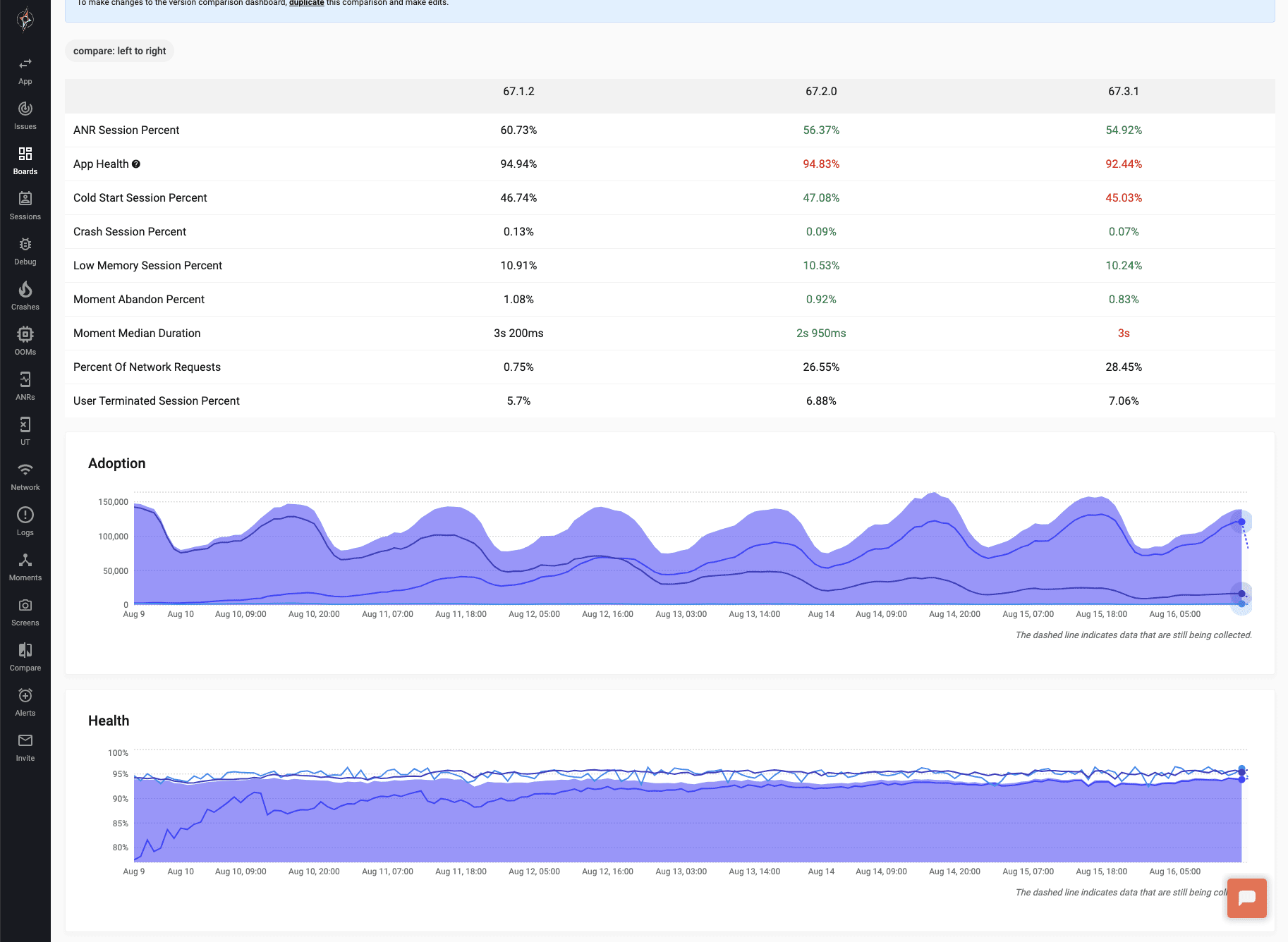
The image below shows the updated app adoption rate and health graphs and the updated version comparison graphs on the new dashboard.
And that’s it! We’ve added dark mode, so Embrace users can choose the color scheme that works best for them. We have also updated our UI on our dashboard, so your mobile app data is easier to understand, and our dashboard is simple to use for everyone on your mobile team. Whether you’re attempting to find something on the navigation panel, making a custom dashboard quickly, trying to spot your key metrics easily, or gaining a better understanding of your graphs, mobile teams can get the data they need to solve issues and make key business decisions quickly.
As always, please share feedback so we can continue building features and improvements that help your team succeed.
How Embrace Helps Mobile Teams
Embrace is the category leader in Mobile Experience Engineering. By empowering engineers to manage the complexity of mobile, Embrace helps them build bolder and better experiences.
With Embrace, engineers can identify and prioritize the impact of any issue, with detailed behavioral and technical context to resolve them instantly.
Learn more, and explore Embrace today.
Get started today with 1 million free user sessions.
Get started free